
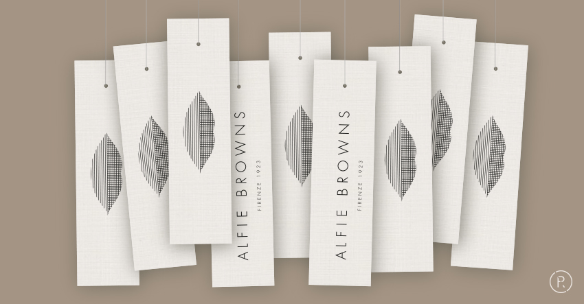
The Alfie Browns & Co logo tells a story of femininity, nature and the fabric of life itself. The ABC of how an appropriate, refined attire could be. 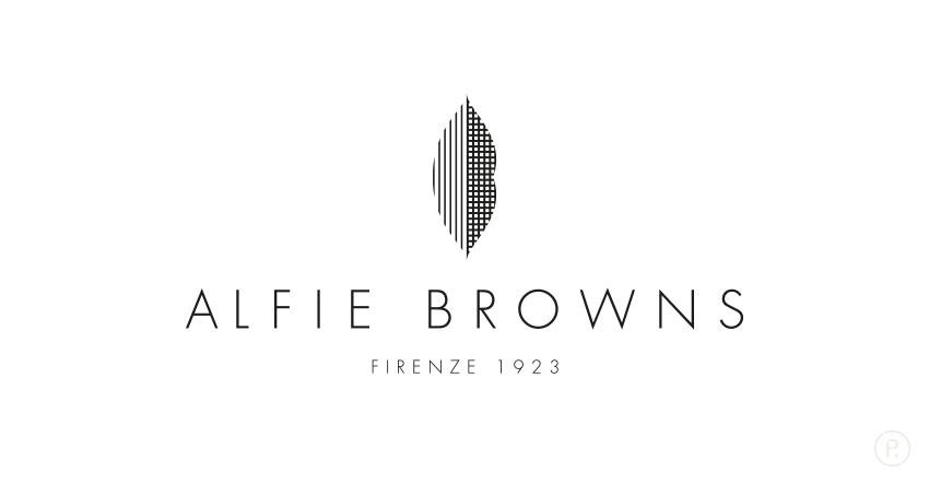
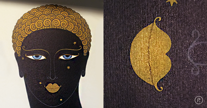
The inspiration for the brand’s trademark came from a print I received as present at the time of the assignment with Erte’s famous illustration, The Queen of Sheba.
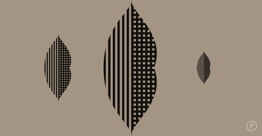
The process was a bit longer. I wanted to include the concept of fabric and make it sure it was also a monogram.
Many are the hidden meanings intertwined is the simple sign.
A+B+C becoming lips.

The fabric of life, one becoming two, intertwining.

One might see also the leaf of one of the Tuscan olive trees growing by the firm, near Montecatini.


Alfie Browns is based in Singapore. Please, visit the Company’s website: https://www.alfiebrowns.com

