Space, A Resource For All Mankind. The hexagon in orbit is the symbol of Carbon, what we humans are made of, and it’s also a cubesat in perspective. The A is an arrow pointing at the sky.
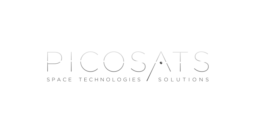
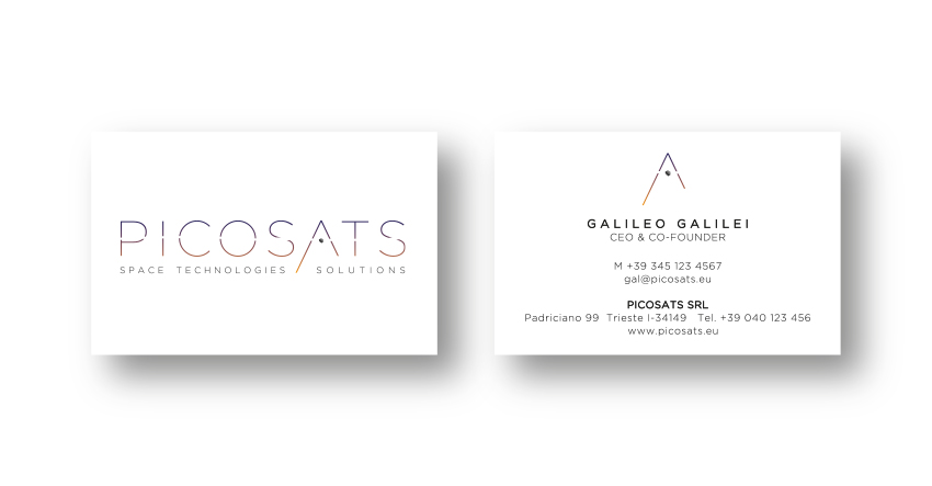
The Picosats logotype, whole and complete with the carbon symbol and the A as an arrow pointing at the space above us all.
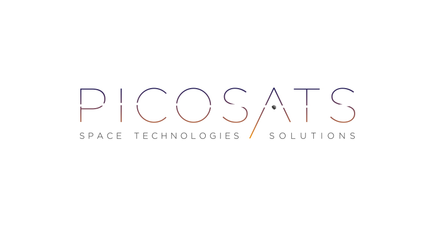
The Picosats logotype in full color, a gradient made with the colours of the sky at dawn.
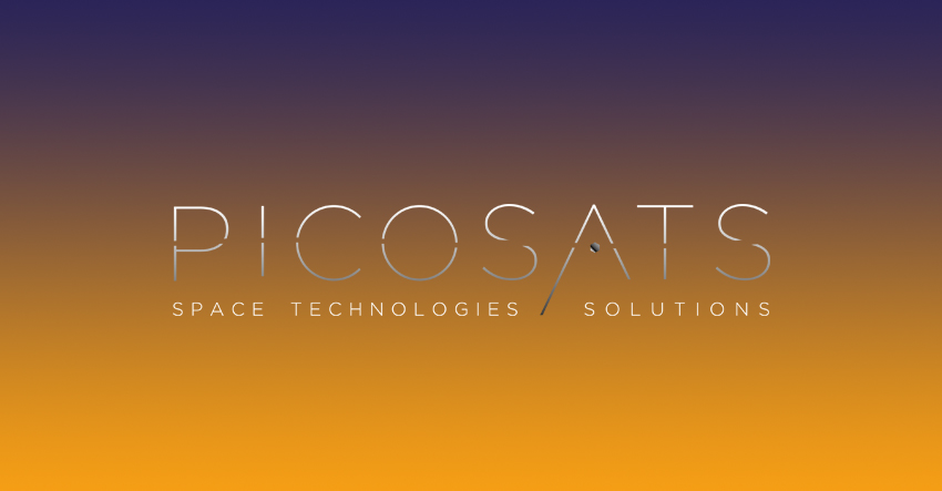
The light gradient is used on dark backgrounds.
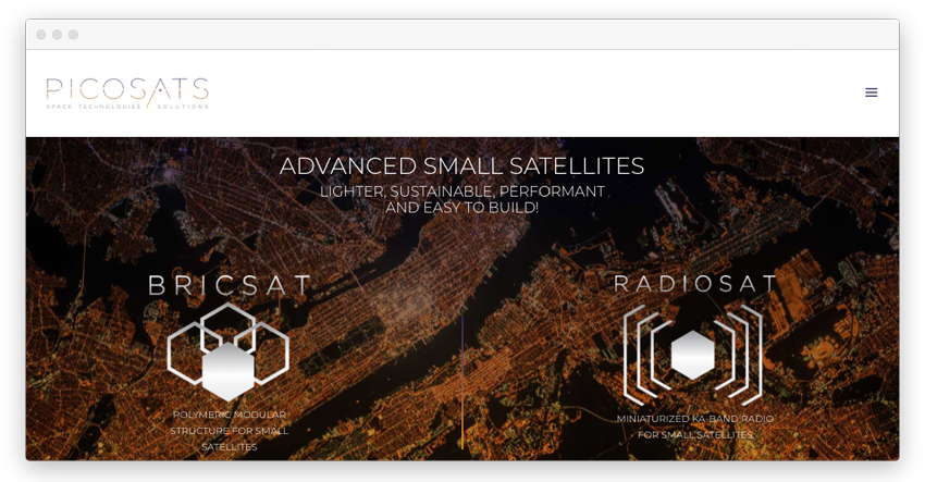
Picosats invented a smarter and cleaner way to build, ship in space nano-satellites and destroy them during reentering the atmosphere.
Picosats makes nano-satellites speak to each other and all together with earth.
Technology explained with clarity. A web minimal design concept applied to some of the most complex results of research, technology.The design of the logotype came with a full style-guide, corporate identity, made to last.Space, the last frontier. I was so excited to create something that will be one day soon in the sky. These were the benchmarks and the reference. I boldly went where no graphic designer has gone before. Spot the impostor. Dear friends of Picosats, it was a pleasure to work with you all. May the force be with you.
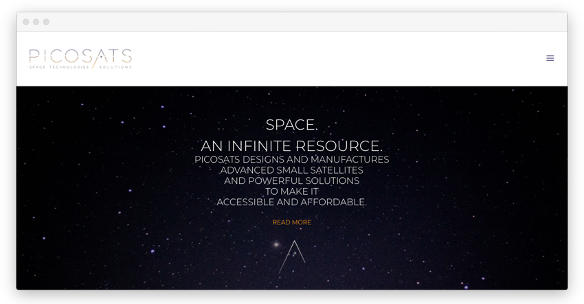
Space, an infinite, affordable resource for all mankind.
Picosats creates and produces affordable and advanced technological solutions invented by the geniuses who started this Trieste University’s young spin off, dealing with nano-satellites – and they’re aiming high. PICO stands for small in Italian, SAT is for satellites, TS is the acronym of Trieste, Italy, where the Company was born.