![]()
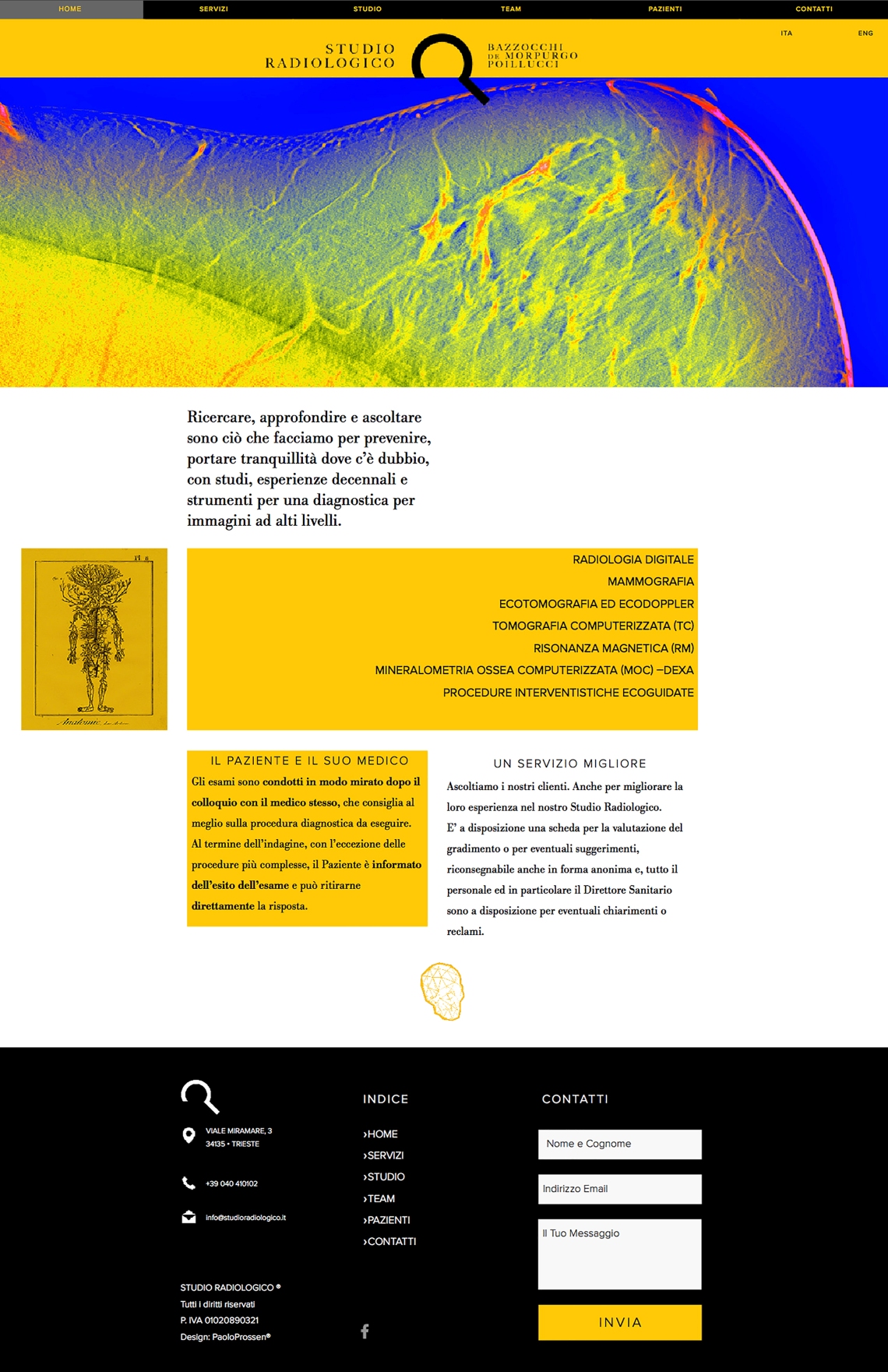
“Searching, deepening and listening is what we do to prevent, bringing tranquility where there is doubt with studies, decades of experience and tools for diagnostic imaging at high levels.”
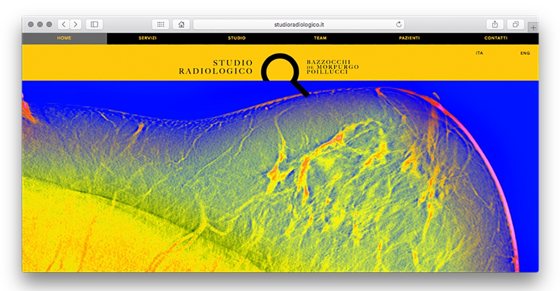
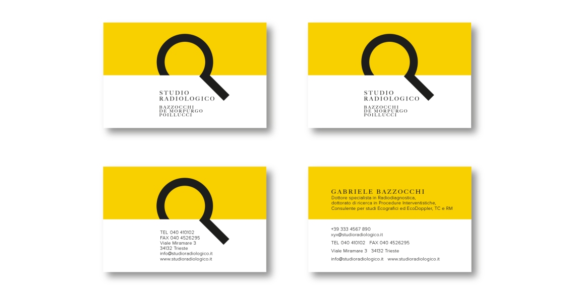
The project began with the request of redesigning the website of the best radiology private practice in Trieste, Italy. I asked to start from the logotype and reviewing texts and translations.
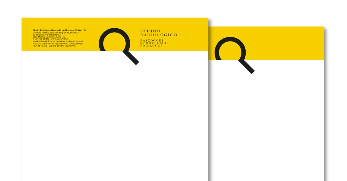
The logotype was born from a long interview with the client, I simplified the Company purpose to a sentence, the declaration mentioned above. Research for clues inside our bodies is at the source of peace or action. The colors I wanted to use were suddenly clear and far from the light blue/greens medical practices overused and abused around the world. I wanted to bring full attentionality.
![]()
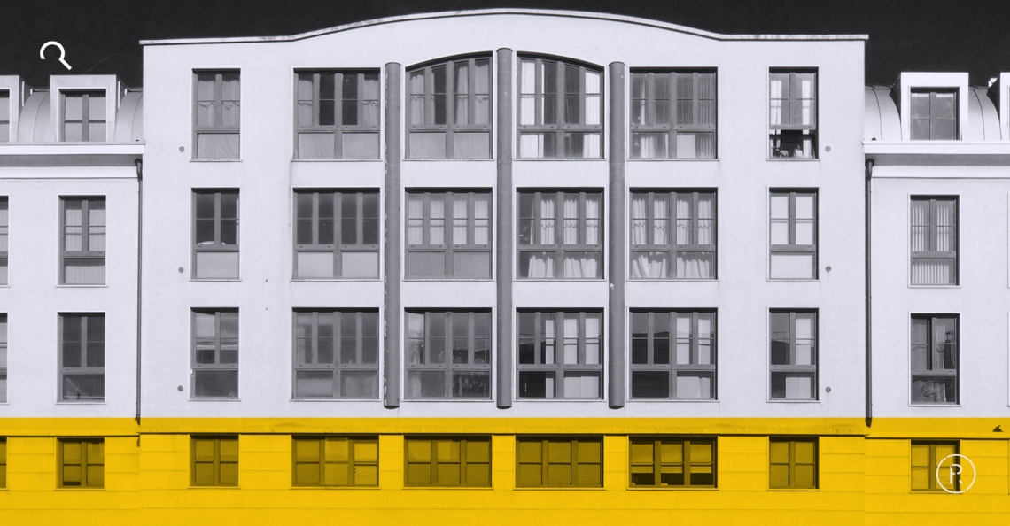
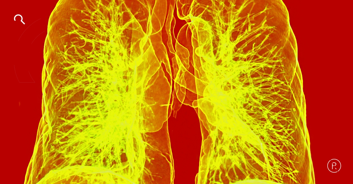
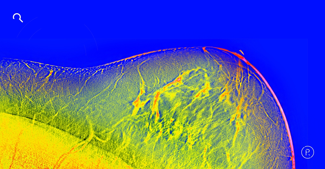
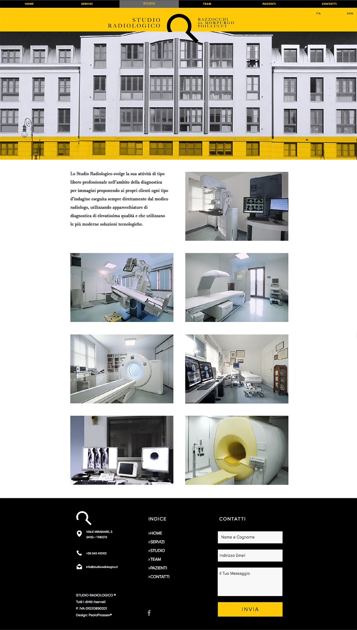
Imagery came next: the client and I agreed in exploring creatively the world of medical visuals, of radiology and digital scanning. We both wanted an explosion of vivid colors. Massimo Cetin shot the intern photography, giving the sense of professional order and clinical spotlessness.