Jonathan Rosa è un educatore e consulente dell’educazione che ha lavorato a lungo all’interno delle più grandi scuole internazionali in Svizzera. In parole semplici, aiuta una giovane persona a scegliere la scuola giusta e cosa vorrà fare da grande.
Quando ha scelto di aprire la propria società, offrendo servizi di consulenza a famiglie, collegi e organizzazioni scolastiche in tutto il mondo, mi ha chiamato per aiutarlo a creare un naming e un logotipo.
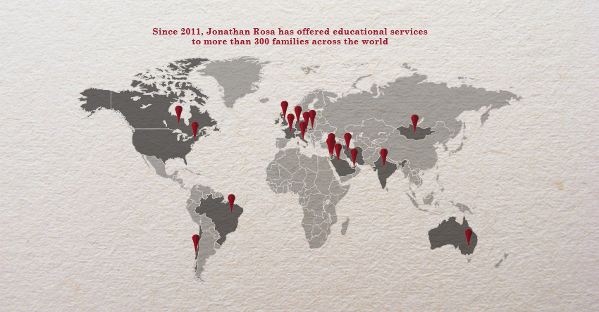
Dalle nostre conversazioni è emerso quanto gli stia a cuore il successo di ognuno dei giovani studenti come fossero preziosi boccioli di un roseto, creando un legame con il nome di famiglia di Jonathan. Essere la loro bussola è altamente motivante.
La riuscita dello studente e della studentessa sta nel realizzare le loro vite sfruttando al massimo le proprie potenzialità, dando loro la giusta direzione.
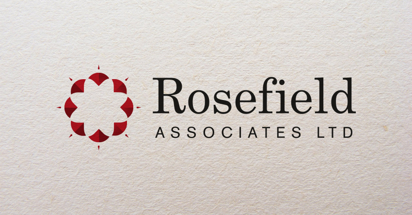
‘Jonathan Rosa indica la strada come una rosa dei venti.’
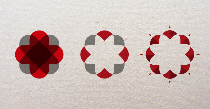
Il simbolo della somma e della moltiplicazione sovrapposti creano una rosa dei venti.
Il carattere utilizzato per il logotipo e per l’immagine coordinata è il Century Schoolbook, un carattere creato cento anni fa da M. F. Benton per essere facilmente leggibile, su richiesta di un editore di libri scolastici.
La palette di colori è basata sul rosso, così come la croce nascosta nel marchio, sono entrambi un omaggio alla bandiera Svizzera, il Paese d’origine di Jonathan, che adesso vive tra Londra e Roma. Il grigio è per me il colore di un libro di testo se socchiudo gli occhi, così come i colori pastello sono un ricordo dei libri illustrati di quando ero piccolo.
Jonathan Rosa is an educational consultant who has worked extensively in the largest international schools in Switzerland.
When he chose to open his own company, offering consulting services to families, colleges and school organisations around the world, he called me to help him create a naming and a logotype.
From our conversations it emerged how much he cares about the success of each of the young students as they were precious rosebud buds, creating a liaison with the family name of Jonathan. Being their compass is highly motivating.
The success of the student and the student lies in realising their lives making the most of their potential, giving them and their parents the right direction.
‘Jonathan Rosa indicates the path like a rose of winds.’
The symbol of the superimposed sum and multiplication signs creates a compass.
The character used for the logotype and for the coordinated image is the Century Schoolbook, a character created by M. F. Benton to be easily read, 100 years ago, at the request of a school book publisher.
The color palette is based on red, as is the cross hidden in the brand, they are a tribute to the flag of Switzerland, the country of origin of Jonathan, who now lives between London and Rome. Grey, the color of a textbook if you close the eyes and the pastel colours of the illustrations of when I was a child.
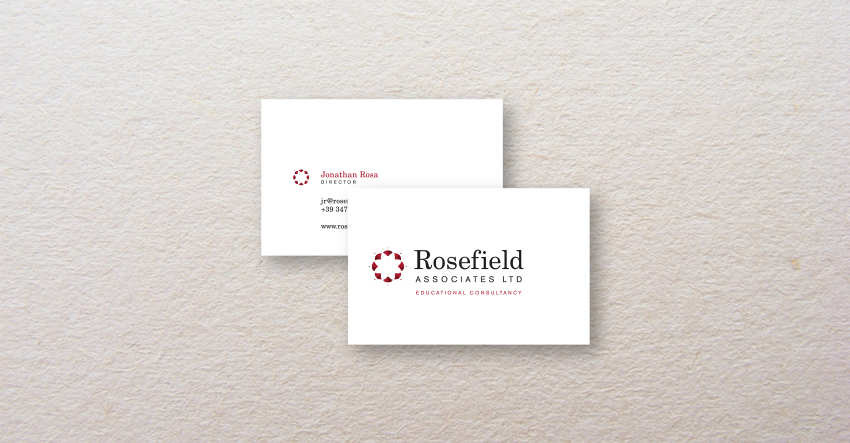
The trademark is a rose of winds.How the trademark has been created.The logotype is written with Century Schoolbook, designed one hundred years ago by Benton.The business cards.
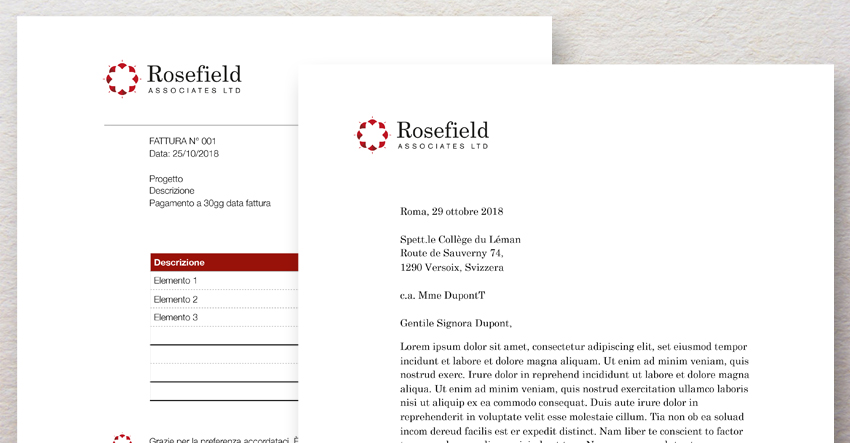
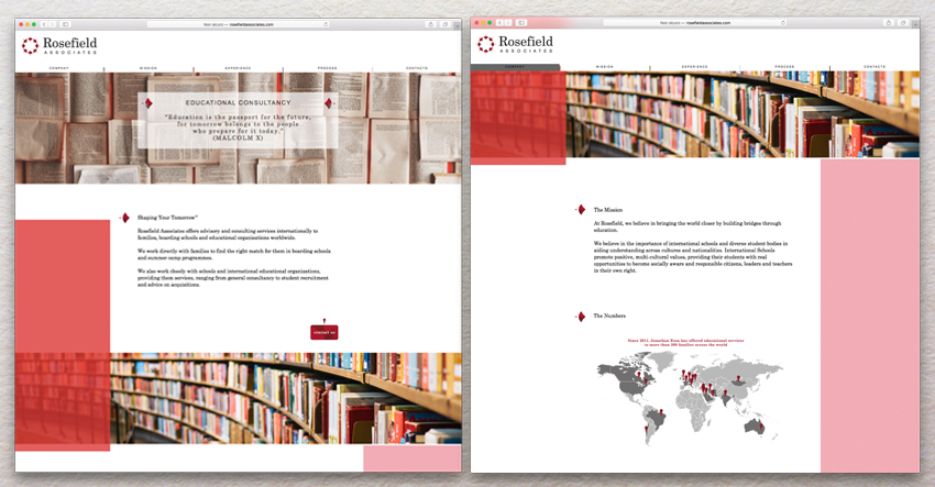
Corporate identity includes digital letterheads and invoices.The primary and secondary colour palettes.The website, http://rosefieldassociates.com/